

px to rem: CSS Unit Converter
Phuc Pham · Graphics & Design
Independent analytics for this App Store listing. AppTracker is not affiliated with Phuc Pham.
Chart standing · US
In-app purchases · US
What this app sells inside itself, grouped by kind and priced for this storefront.
Screenshots



About
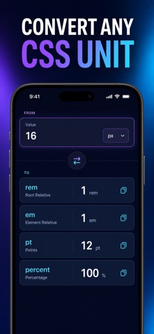
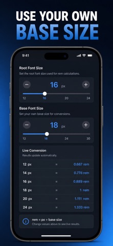
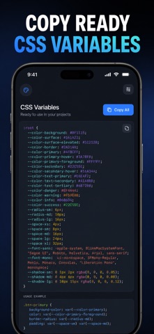
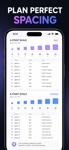
px to rem, rem to px, em, pt and % — converted the moment you type, against the root font size your project actually uses. Most converters assume a 16px root and stop there. This one lets you set the root font size, the em context size and the DPI once, then recomputes everything against that base: the live conversions, the modular type scale, the spacing tokens and the cross-platform density table. It is a native iPhone tool, so there is no browser tab to hunt for and no connection required. WHAT YOU GET - Every unit at once: enter one value and read px, rem, em, pt and % side by side, each copyable with a single tap - Your own base: root size, em context and DPI sliders, so a 62.5% root or a non-96 DPI setup gives correct numbers instead of textbook ones - Modular type scales: pick a base and a ratio from Minor Second to Golden Ratio and get Display down to Caption in px and rem - Copy-ready CSS: export the whole type scale or spacing set as :root custom properties, written in rem with px comments - 4pt and 8pt spacing tokens with common breakpoints from 640 to 1536, shown in px and rem together PERFECT FOR - Front-end developers turning a design file into real stylesheet values - UI and product designers keeping type and spacing consistent across screens - Design system maintainers who want one source of truth for their tokens - Anyone learning why rem, em and % behave differently, with a built-in Learn tab that explains each unit WHY NOT JUST USE A WEB CONVERTER? A web converter forgets your base the second you close the tab, handles one value at a time, and gives you nothing to paste. Here your root size, context size and DPI persist, results appear in all five units simultaneously, pinned values stay in a Saved tab, and the type and spacing scales come out as CSS you can drop straight into a stylesheet. PRIVACY Everything is computed and stored on your device. No account, no sign-in, no ads, no analytics, no data leaves your phone. The app works completely offline. FULL ACCESS Full access unlocks the modular type-scale generator, the CSS variable export, the 4pt/8pt spacing and cross-platform density tools, plus unlimited pinned conversions and saved history. Choose a weekly plan, a yearly plan, or a one-time lifetime purchase. Payment is charged to your Apple Account at confirmation. Subscriptions renew automatically unless cancelled at least 24 hours before the current period ends, and can be managed or cancelled in your App Store account settings. The lifetime option is a single purchase and does not renew. Set your root size, type your first value, and paste the result straight into your stylesheet. Terms of Use (EULA): https://web-levi.web.app/terms Privacy Policy: https://web-levi.web.app/privacy-policy Questions? tphuc.work@gmail.com
What's new · 1.1.1
Bug fixes and performance improvements.
Details