

Taiwan Air, check PM2.5 easier
KF PUN · Weather
Independent analytics for this App Store listing. AppTracker is not affiliated with KF PUN.
Chart standing · US
What changed · US
Listing changes AppTracker has observed for this app in this storefront — new versions, price moves, rating shifts, and store copy.
A redesigned station screen that tells you, in one line, whether the air is getting better or worse. 24-HOUR AIR QUALITY TREND Open any station and see its last 24 hours of AQI, colour-coded hour by hour, with a plain-language verdict above the chart: improving, getting worse, or holding steady. The day's low, high and average sit underneath. The verdict compares averages rather than single readings, so one bad hour doesn't flip the answer. A NEW STATION SCREEN Station name, township, county and air quality zone now sit together in one header. All six pollutants are listed at once — no more switching between them one at a time. Wind, address, coordinates and health advice each have their own place, and every reading shows how many hours old it is. BETTER SEARCH Stations are grouped by air quality zone and ordered roughly north to south, and you can now search by township or county name instead of only by station name. FASTER AND MORE STABLE Rebuilt with the latest tooling, with updated maps and components throughout, plus a range of stability and performance fixes. Questions or suggestions? Write to info@dllm.io — we read every one.
Ratings breakdown · US
The star breakdown behind this app's rating in this storefront.
Screenshots

About
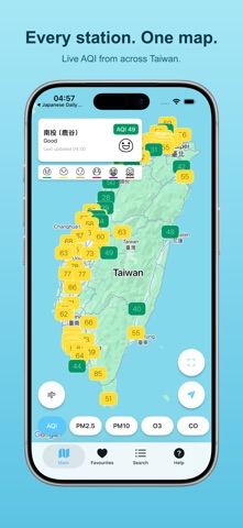
Taiwan Air shows you the air you are actually breathing, right now, measured by the government monitoring stations across Taiwan. IS IT GETTING BETTER OR WORSE? Every station screen answers the question you actually have. A 24-hour AQI chart, colour-coded hour by hour, with a one-line verdict above it: improving, getting worse, or steady. The day's low, high and average sit underneath. No chart-reading required. A LIVE MAP OF EVERY STATION • Every official monitoring station on one map, each pinned with its current reading and coloured by health band • Switch the whole map between AQI, PM2.5, PM10, O3, CO, SO2 and NO2 • Wind mode turns every marker into an arrow — which way the pollution is blowing, and how hard • The station nearest you stays on screen with its reading and the time it was measured • Readings refresh automatically; the map reopens exactly where you left it EVERY NUMBER, FOR EVERY STATION • AQI plus all six pollutants: PM2.5, PM10, ozone, carbon monoxide, sulphur dioxide and nitrogen dioxide • Wind direction and speed, in plain words • Health guidance for the general public and for sensitive groups • Station address, coordinates, station type and air-quality region • Exactly when the reading was published, and how long ago that was ALERTS THAT RESPECT YOUR SLEEP • Get a push notification when AQI at a station you care about rises above your threshold • Or when it drops below one — so you know when it is safe to open the windows again • Set a Do Not Disturb window and nothing arrives overnight BUILT FOR EVERY DAY • Save home, work and school as favourites and check them all at a glance • Search every station by name, town or county, grouped by air-quality region • Available in English and 繁體中文 • A single in-app purchase removes every ad, permanently WHY IT MATTERS Air pollution is not only a respiratory problem. It raises the risk of cardiovascular disease, stroke and other chronic illness, and in 2013 the International Agency for Research on Cancer classified outdoor air pollution as a Group 1 carcinogen. Children and older adults are affected most. Thirty seconds before you leave the house tells you whether to take the mask, or to run the purifier instead of opening the window. WHERE THE DATA COMES FROM Every reading is open data published by Taiwan's Ministry of Environment air quality monitoring network. We display it; we do not adjust it. Questions, problems or ideas? Write to info@dllm.io — we read everything.
What's new · 3.0.0
A redesigned station screen that tells you, in one line, whether the air is getting better or worse. 24-HOUR AIR QUALITY TREND Open any station and see its last 24 hours of AQI, colour-coded hour by hour, with a plain-language verdict above the chart: improving, getting worse, or holding steady. The day's low, high and average sit underneath. The verdict compares averages rather than single readings, so one bad hour doesn't flip the answer. A NEW STATION SCREEN Station name, township, county and air quality zone now sit together in one header. All six pollutants are listed at once — no more switching between them one at a time. Wind, address, coordinates and health advice each have their own place, and every reading shows how many hours old it is. BETTER SEARCH Stations are grouped by air quality zone and ordered roughly north to south, and you can now search by township or county name instead of only by station name. FASTER AND MORE STABLE Rebuilt with the latest tooling, with updated maps and components throughout, plus a range of stability and performance fixes. Questions or suggestions? Write to info@dllm.io — we read every one.
Details